Menu Pricing
How a menu is actually read
By Noriva · 12 May 2026
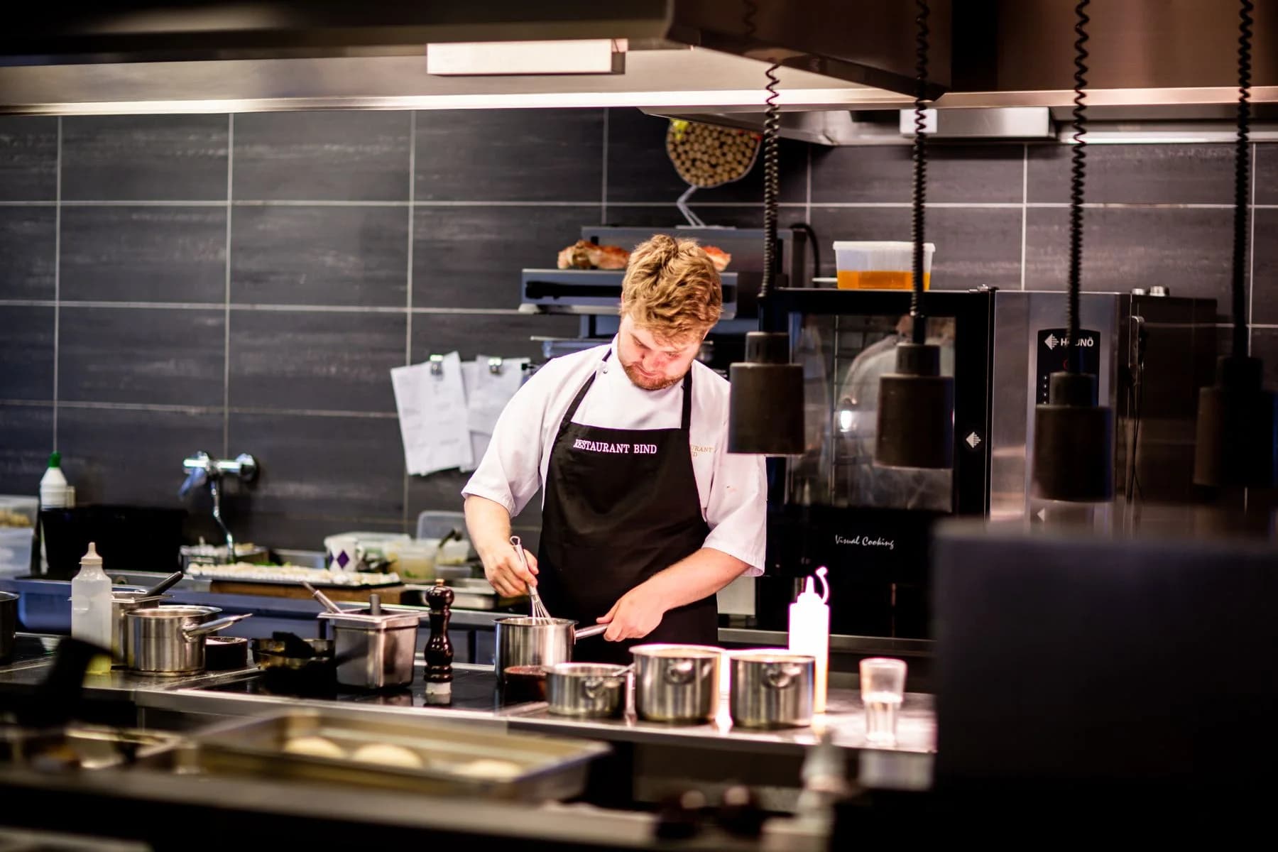
A guest spends under two minutes with a menu, in poor light, while talking. Sequence, hierarchy and description decide more of what gets ordered than most operators assume.
A menu is written as a document and read as an object. It is scanned rather than studied, in the venue's light, at the venue's table size, by someone who is hungry, in company, and unwilling to look indecisive. Design decisions that ignore those conditions quietly change what gets ordered.
## Reading is scanning
Guests do not read a menu line by line. They scan for a category, then scan within it, then commit. Two consequences follow.
**Category names do more work than item names.** If a guest cannot find the category they are looking for, they will not discover the item inside it. Categories named cleverly rather than clearly cost orders.
**Position within a category matters.** The first items in a list receive more attention than the middle. This is not a trick to be exploited so much as a fact to be respected: the items you most want to sell should not be buried at position seven of nine.
## Length is a decision, not a default
A long menu signals choice and, past a point, signals a kitchen that cannot be excellent at all of it. It also slows ordering, which slows table turns, which is a revenue consequence rather than a stylistic one.
More practically, every additional item consumes stock, prep, training and menu space, and adds a possible failure at peak. Menu length should follow from the concept and the kitchen's capacity, not from a reluctance to remove anything.
## Descriptions are read selectively
Long descriptions are skimmed and often skipped entirely. The parts that get read are the first few words and anything visually distinct.
A useful discipline: the first three words of a description should say what the dish is, not how it was made or how it was felt about. Provenance and technique can follow; they cannot lead.
## Price presentation changes behaviour
Prices aligned in a column invite comparison down the column. The guest reads the menu by price rather than by dish, and the decision becomes an economic one rather than an appetite one.
Placing the price immediately after the description, in the same weight as the body text, keeps the dish as the subject. Currency symbols and trailing zeros add visual weight to a number that does not need it.
Threshold effects are real: prices are read in bands, so an item that crosses from one band to the next is noticed in a way an equivalent increase within a band is not.
## The physical conditions
This is the part most often forgotten in a design review that happens on a screen.
Menus are read at the venue's light level, which is usually far lower than the studio's. They are read at arm's length on a small table, sometimes shared. They are handled repeatedly, so paper stock and finish decide how the menu looks after a month rather than on day one.
Print a proof and read it in the room at the hour guests come. It is the cheapest test available and it catches most legibility failures.
## Bilingual menus are not mirrored menus
An Arabic and English menu is two typographic systems that need to be balanced rather than reflected. Line lengths differ, optical sizes differ, and a layout designed in one direction and flipped will read awkwardly in the other.
Decide deliberately whether the two languages sit side by side, on facing pages, or in separate menus. Each is legitimate; what fails is treating one language as a caption to the other.
## Practical recommendations
1. Name categories for findability, not for cleverness.
2. Put the items you want to sell where attention naturally lands, not where they fell historically.
3. Cut description length; lead with what the dish is.
4. Remove the price column. Let the price follow the description.
5. Proof in the room, in the venue's light, at the venue's table size.
6. Design both languages together rather than translating a finished layout.
7. Re-check the menu's structure after every significant change to the list.
## In short
Menu design is not decoration applied to a list of dishes. It is the interface through which the commercial decisions of the business are delivered to a guest in under two minutes — and small changes to sequence, hierarchy and price presentation move real money.
- #menu
- #design
- #psychology